How to Combine Different Styles Seamlessly
Choosing the right combination of fonts is an art that can elevate your design from ordinary to extraordinary. Pairing fonts effectively ensures harmony, enhances readability, and reinforces the overall aesthetic of your project. However, combining fonts with different styles can be tricky.
The Basics of Font Pairing
Before diving into examples, it’s crucial to understand the core principles that guide successful font combinations:
- Contrast vs. Complement: Fonts should either contrast enough to create visual interest or complement each other to maintain cohesion. Avoid pairings that are too similar, as they may look mismatched or redundant.
- Establish Hierarchy: Assign clear roles to each font. For instance, one font can be used for headings while another is for body text. This helps guide the reader’s eye and organizes information effectively.
- Balance the Mood: The tone of the fonts should align with the message. For example, a playful font pairs well with a casual serif or sans-serif, while a modern geometric font complements a clean, minimalist style.
- Mind the Context: Consider the purpose and medium of your design. Fonts that work well on a web interface might not perform the same in print.
Font Styles That Pair Perfectly
Serif and Sans-Serif

The classic pairing of a serif font and a sans-serif font creates a balanced and versatile combination. Serif fonts, with their elegant strokes, provide a sense of tradition, while sans-serif fonts bring a modern and clean contrast.
Examples:
- Serif: Turquoise, Norman
- Sans-Serif: TotalBlack, Performa
Pairing Suggestion: Turquoise (for headings) with Performa (for body text).
Script and Sans-Serif

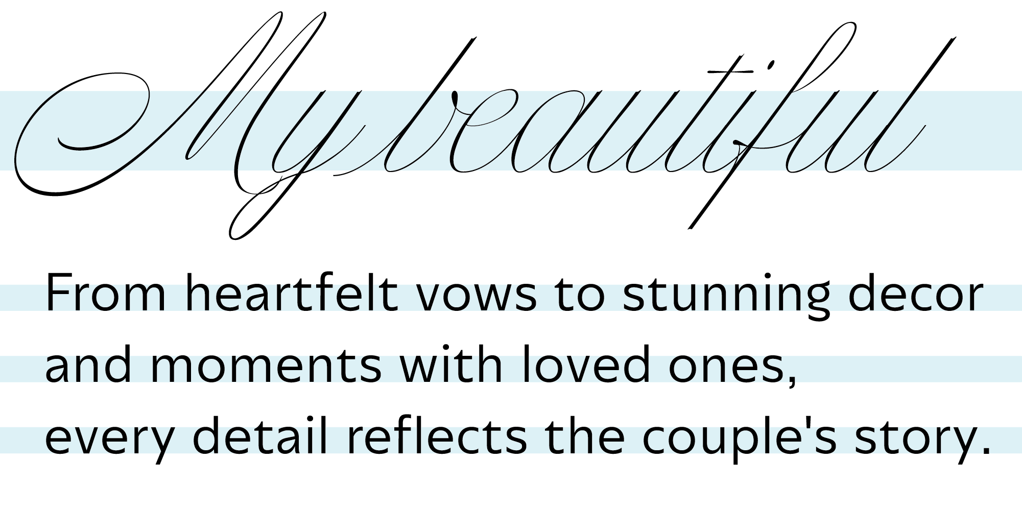
Script fonts add a touch of elegance and personality, making them ideal for display purposes, while sans-serif fonts keep the overall design grounded and readable.
Examples:
Pairing Suggestion: Nautica (for short titles) with Annuario (for paragraphs).
Slab Serif and Sans-Serif

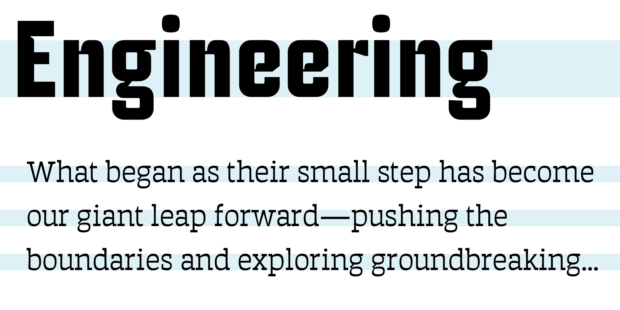
Slab serif fonts are bold and commanding, often used for impactful headlines. Pairing them with a neutral sans-serif font softens the design while maintaining a strong visual presence.
Examples:
- Slab Serif: Auster Slab, Apero
- Sans-Serif: Auster, TotalBlack
Pairing Suggestion: Auster Slab (for body text) with Industria Sans (for Titles).
Tips for Perfect Pairings
Limit Your Palette: Stick to two or three fonts per design. Too many fonts can make your work look cluttered. Experiment with Weights: Use different weights (light, regular, bold) within the same font family to create contrast without introducing additional typefaces.Final Thoughts
Font pairing is both a science and an art. By understanding the principles of contrast, hierarchy, and mood, you can create stunning combinations even with fonts that have distinct styles. Practice and experimentation are key—don’t be afraid to explore new pairings and push creative boundaries.
Whether you’re designing a website, a poster, or a brand identity, thoughtful font pairing can make all the difference. So next time you’re faced with the challenge of mixing styles, use these principles and examples as your guide.
